Dashboard UI: Crafting Insightful, User-Centric Interfaces
A well-designed dashboard UI seamlessly transforms complex datasets into clear, actionable insights. By blending visual clarity with intuitive controls, dashboards empower users-from product designers to data analysts-to make informed decisions without delay. In this guide, we delve into the core principles of dashboard design, explain how to optimize user experience, and illustrate each concept with placeholders for real-world examples and galleries.
A well-designed dashboard UI seamlessly transforms complex datasets into clear, actionable insights. By blending visual clarity with intuitive controls, dashboards empower users — from product designers to data analysts — to make informed decisions without delay. In this guide, we delve into the core principles of dashboard design, explain how to optimize user experience, and illustrate each concept with placeholders for real-world examples and galleries.
What Is a Dashboard UI?
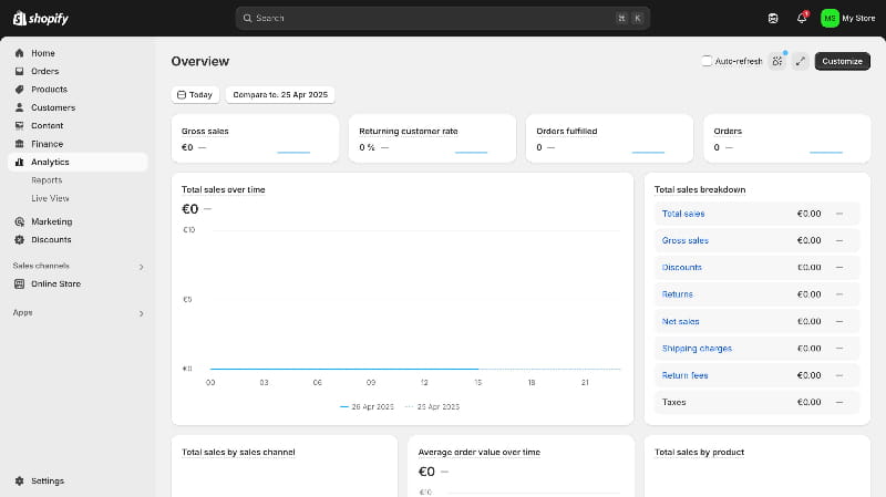
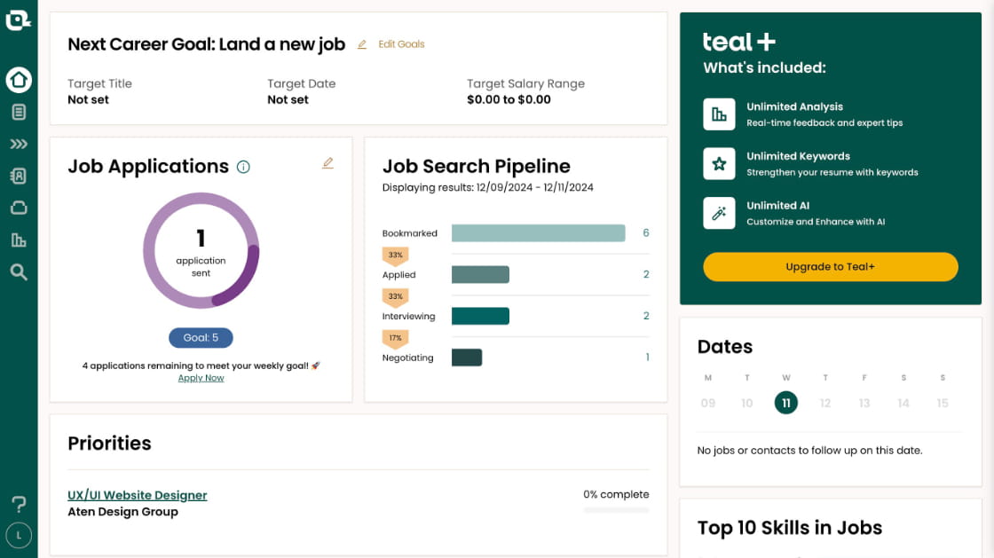
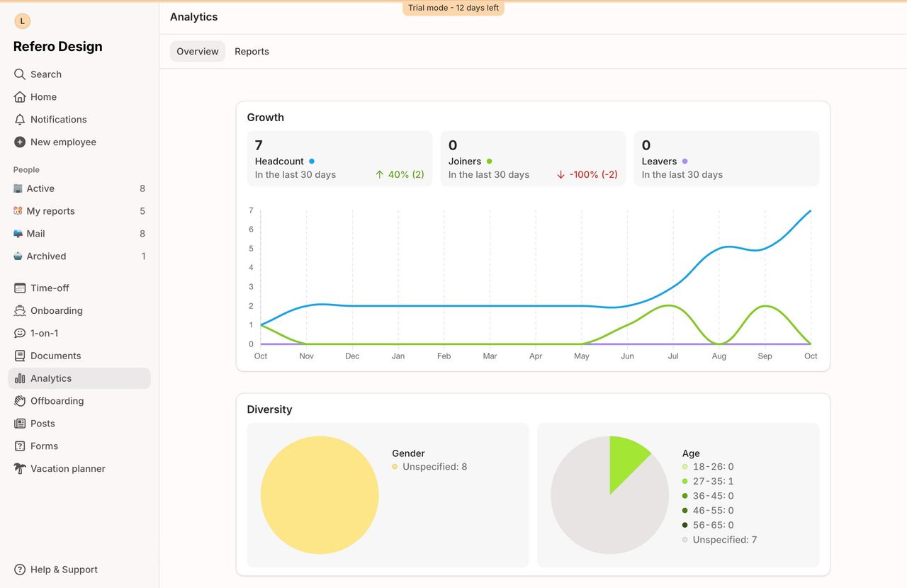
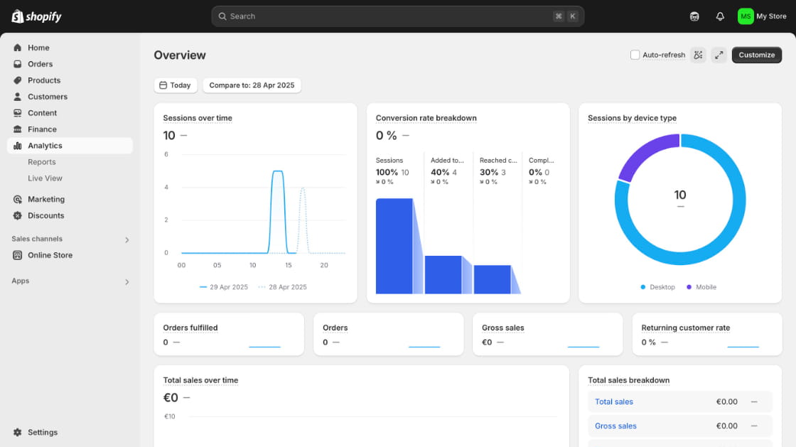
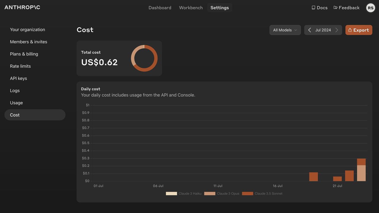
A dashboard UI serves as a centralized hub where diverse metrics, charts, and key performance indicators converge into a unified display. Unlike static reports, dashboards are dynamic: they update in real time, allow interactive filtering, and adapt to various user roles. Whether monitoring marketing analytics or tracking product performance, the goal remains the same — deliver clarity at a glance.
Key Principles of Effective Dashboard Design
Clarity and Focus
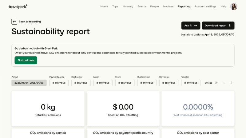
Effective dashboards avoid visual clutter by emphasizing only the most critical information. Instead of listing every available metric, identify the top three or four indicators that align with your user’s objectives. If additional details are necessary, use progressive disclosure techniques — such as expandable panels or tooltips — to reveal deeper layers of data without overwhelming the primary view.
Visual Hierarchy and Layout
Establish a clear hierarchy by placing the most important widgets in prominent areas — typically the top-left quadrant where the eye naturally lands. Size and spacing play a crucial role: larger cards or bold typography draw attention, while ample whitespace guides the user smoothly across sections. A consistent grid system, such as a 12-column layout, ensures that components align harmoniously across devices.
Consistency and Affordance
Users should encounter uniform styling across chart types, controls, and navigation elements. Consistent color schemes and iconography not only reinforce brand identity but also reduce cognitive load. Interactive elements — buttons, dropdowns, sliders — must clearly indicate their functionality through affordances like hover states or slight animations, signaling to users that these components are actionable.
Optimizing for User Experience
Readability and Typography
Selecting the right typography is essential for readability. Pair a clean, modern sans-serif font for headings with a neutral serif or sans-serif for body text, ensuring a balanced contrast. Hierarchical text styles — ranging from H2 for section titles to standard paragraph text — facilitate quick scanning and improve accessibility for screen readers.
Color Usage and Accessibility
Choose a palette that supports semantic meaning: use green to denote positive trends and red for declines, while maintaining a neutral base palette to avoid visual fatigue. All color combinations must adhere to WCAG contrast ratios to ensure legibility for users with visual impairments.
Responsive and Mobile-First Design
Begin with a mobile-first approach, designing dashboards that collapse complex charts into simplified sparkline or summary views on smaller screens. Employ responsive breakpoints to adjust layouts gracefully, ensuring that tables and graphs either adapt to available width or hide less critical elements behind toggles.
Data Visualization Best Practices
Selecting Chart Types Thoughtfully
Avoid defaulting to pie charts for intricate data; instead, use line charts to depict trends over time and bar charts for categorical comparisons. For high-density datasets, heatmaps or sparkline charts can convey patterns without consuming excessive space.
Interactive Features and Microinteractions
Interactive elements such as dynamic filters, drill-down menus, and on-hover tooltips enhance user engagement. Animated transitions during data reloads or filter changes help maintain context, illustrating the transformation of data without abrupt jumps.
Advanced Patterns and Personalization
Customizable, Role-Based Dashboards
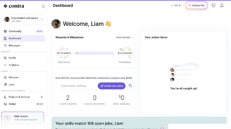
Allow users to tailor their dashboard by rearranging widgets, saving filter presets, or selecting which metrics appear by default. Role-based views ensure that executives see high-level summaries, while analysts can dive into granular data tables and export raw data for further analysis.
Real-Time Data and Alerts
Implement technologies like WebSockets or server-sent events to deliver live updates for critical KPIs. Incorporate notification badges or color-coded alerts when certain thresholds are met, drawing immediate attention to significant changes.
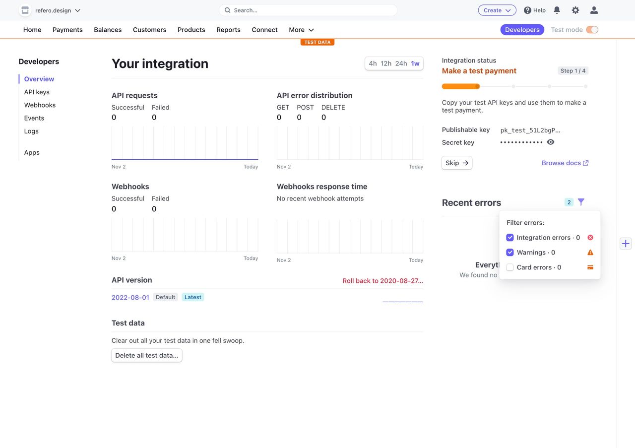
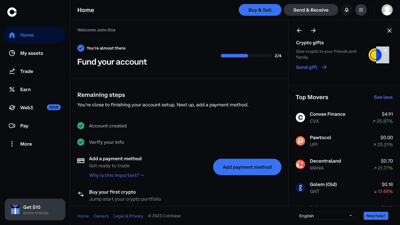
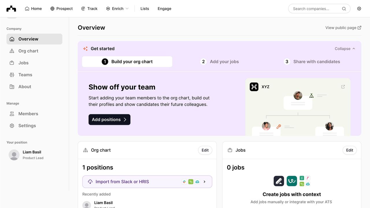
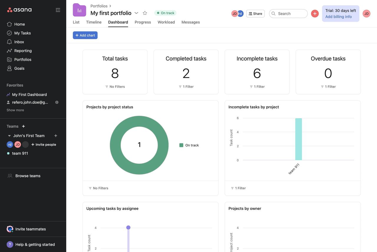
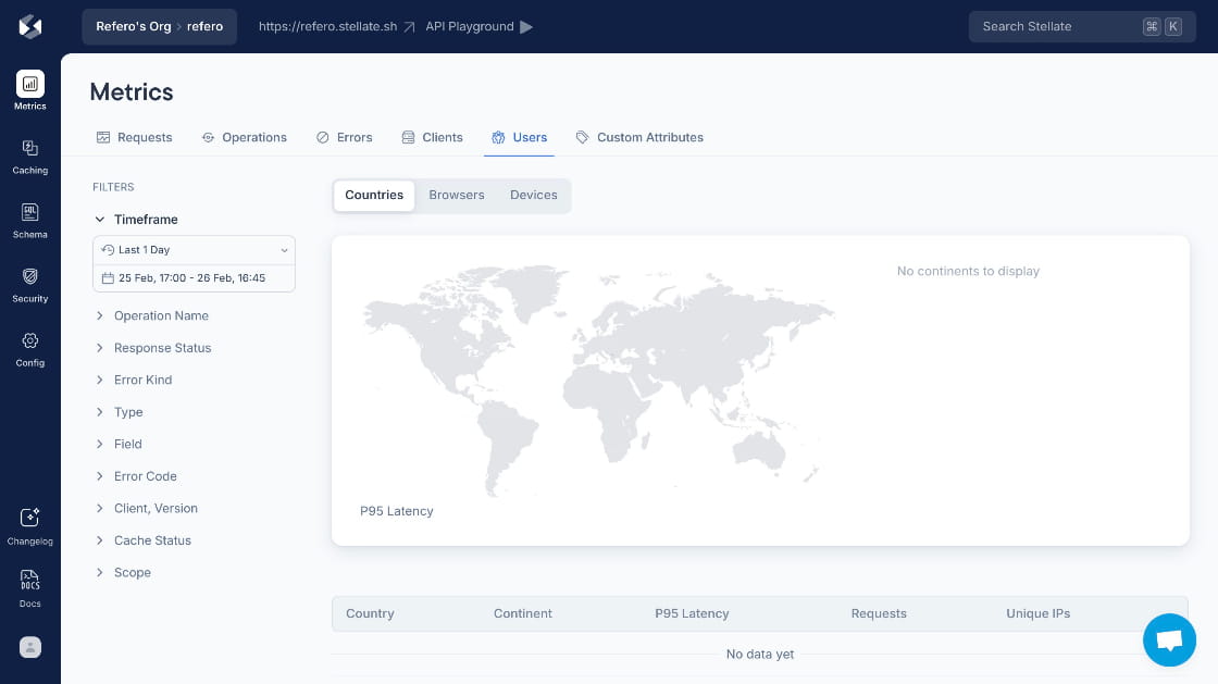
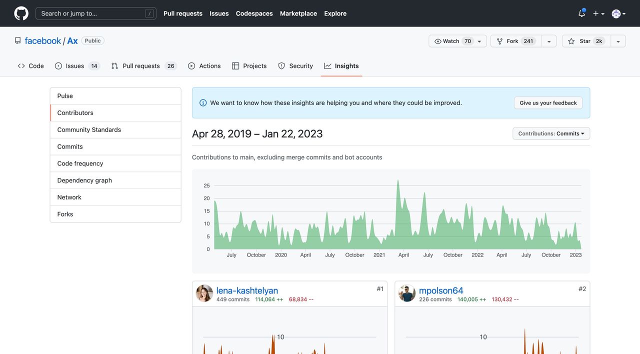
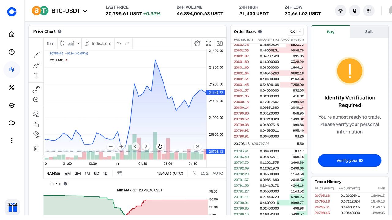
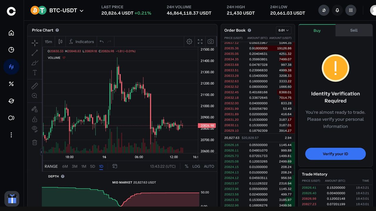
Case Study: Refero’s Extensive UI Example Library
At Refero, we’ve compiled a vast library of dashboard UI examples, covering a wide range of industries and use cases. This collection is curated to help you find the perfect layout, chart type, or interaction pattern in seconds, whether you need a marketing analytics overview or a product performance deep dive. Each example is tagged and searchable — filter by style, data density, or user role — to surface the most relevant solutions instantly.