Login UI Design Guide: Creating an Intuitive User Experience
Hey there, fellow designers and UX enthusiasts! Today, we're diving headfirst into the captivating world of login UI design. You might be thinking, "Why focus so much on the login screen?" Well, my friend, the login screen is like the gateway to your digital realm. It's the very first interaction users have with your app or website, and you know what they say about first impressions, right? So, buckle up as we embark on a journey to craft a seamless, user-friendly, and secure login experience that'll leave your users wanting more.
The Psychology Behind a Great Login Experience
Picture this: You stumble upon a new app that promises to change your life, and you can't wait to dive in. You download it, install it, and with eager anticipation, you're greeted by... a clunky, confusing login screen. Yikes! Instant buzzkill, right? That's the psychology of a first impression for you. You see, your login screen isn't just a bunch of buttons and text fields; it's a reflection of your brand and the experience you offer.
The Power of Familiarity: Ever noticed how your fingers instinctively navigate to the login form's fields? That's the magic of familiarity. People are creatures of habit, and a consistent layout that follows conventional norms can make users feel right at home. Don't reinvent the wheel; just make it spin smoothly.
The Trust Factor: Imagine you're handing over your personal information to a complete stranger. Scary, right? Your users feel the same way when they see a poorly designed login screen. But fear not! We'll cover design elements that help build trust, such as clear security indicators and a clean, professional aesthetic.
Crafting the Perfect Visual Hierarchy
Now that you understand the psychology at play, let's roll up our sleeves and dive into the nitty-gritty of crafting an irresistible login UI. Think of your login screen as a finely choreographed dance; every element has its own move, and together, they create a harmonious masterpiece.
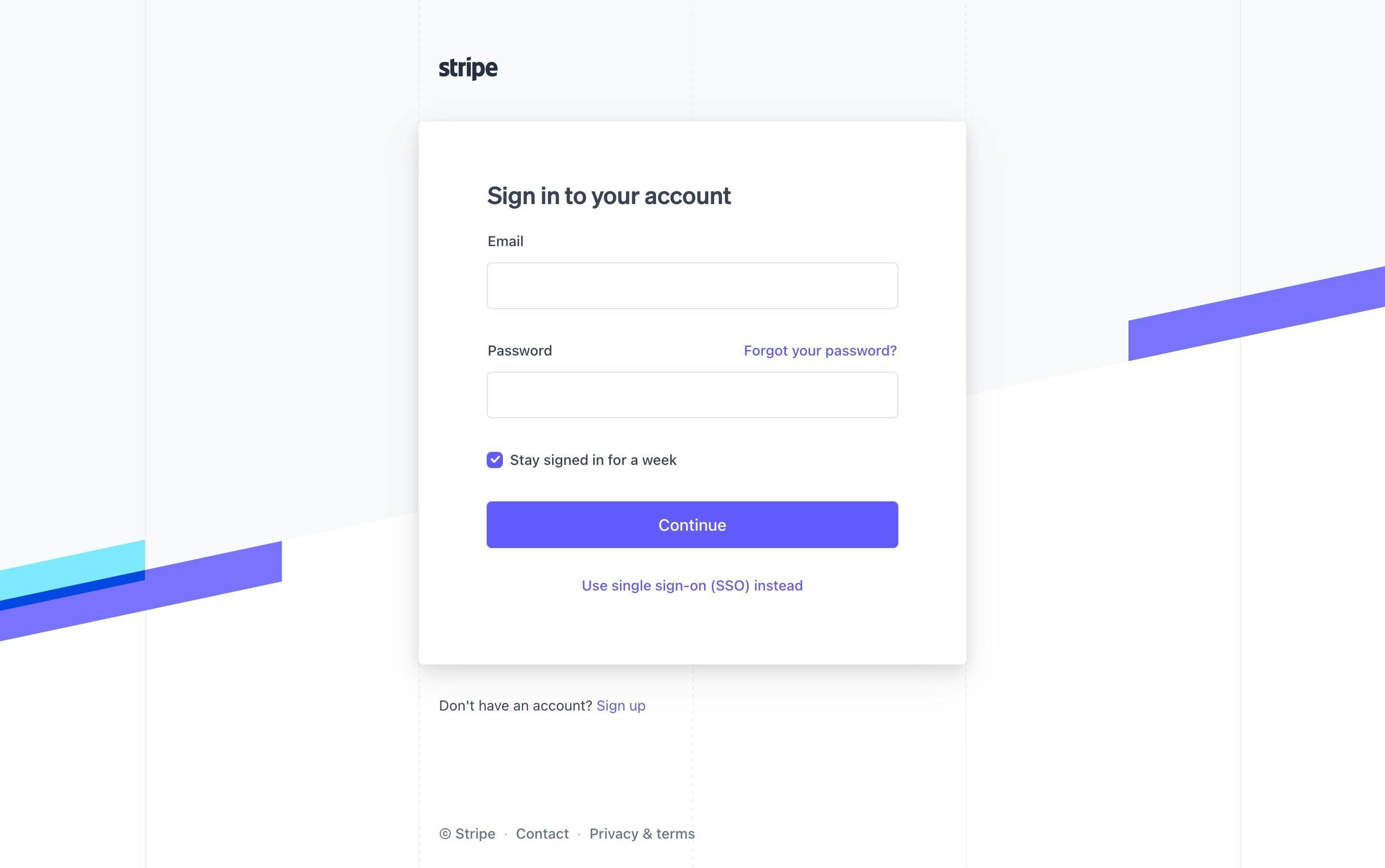
"Log In" or "Sign In"? Bold fonts or subtle elegance? The headline sets the tone for the entire screen. "Log In" feels familiar, like the old leather armchair you sink into after a long day. It exudes a sense of professionalism and seriousness, which can be perfect for corporate platforms. On the other hand, "Sign In" offers a more casual, friendly vibe – like a warm welcome from a close friend. It's great for apps that aim to create a more relaxed, user-centric atmosphere.

Your choice depends on your brand's personality and the type of user experience you're aiming for. So, go with your gut, and remember, you're not just choosing words; you're setting the stage for your users' journey.
Input Elegance: Where Clarity Meets Aesthetics
Text fields are the unsung heroes of your login screen – the silent conduits that users interact with to gain access to their digital world. But they're more than just empty boxes waiting to be filled. They're the portals through which users input their credentials, and they play a crucial role in ensuring a seamless and engaging login experience. In this section, we'll delve deep into the realm of input elegance, where clarity and aesthetics unite to create a harmonious and delightful user interaction.
Guiding Users with Placeholder Text and Labels
Think of placeholders and labels as friendly signposts guiding users through the login process. Placeholder text serves as a subtle hint, suggesting what each text field expects. It's like a gentle whisper in the user's ear, helping them understand what's required without overwhelming them. Labels, on the other hand, provide clear and concise instructions, leaving no room for confusion.
Strike a balance between the two: use placeholders to provide context, and labels to give explicit instructions. For example, "Email Address" can be a label above the field, while a placeholder inside the field might suggest "john.doe@example.com."

Error Messages: A Safety Net with Grace
Nobody likes making mistakes, especially when they're trying to gain access to something important. Error messages are your safety nets – they catch users when they stumble and guide them back on track. But don't settle for bland error messages that simply say "Invalid entry." Inject personality and empathy, let users know what went wrong, and offer actionable solutions. "Oops, that email doesn't look quite right. Double-check and try again!"
And remember, error messages are not just about what's wrong – they're an opportunity to reinforce positive interactions by reassuring users that their issue can be easily resolved.

Visual Consistency: Aesthetics Meet Functionality
Input fields are like puzzle pieces in your login design – they need to fit together seamlessly. Consistency in design elements like border styles, spacing, and font choices creates a cohesive and visually appealing login screen. But it's not just about looking good; it's about enhancing usability. When users see consistent design patterns, they subconsciously understand how to interact with your interface, making the login process feel intuitive and effortless.
By combining the elegance of clear placeholders, instructive labels, empathetic error messages, and consistent design, you're crafting an environment where users feel informed, supported, and empowered to navigate your login screen with ease. Remember, it's not just about input fields; it's about creating an elegant dance of user interaction that leaves a lasting impression.

Font Choices: Speaking Volumes with Typeface.
Fonts have personalities, and they're not shy about showing them off. A bold, sans-serif font screams confidence and modernity, while a classic serif font whispers elegance and tradition. The trick here is to align the font choice with your brand's identity. If you're a cutting-edge tech startup, bold and modern might be your go-to. For a timeless, sophisticated brand, a serif font might be the ticket.

Button Bliss: Crafting an Irresistible Call-to-Action
Meet the rockstar of your login screen: the call-to-action (CTA) button. It's not just a button; it's a gateway to a world of possibilities. In this electrifying section, we're about to dive deep into the art of crafting a button that practically begs to be clicked. Get ready to unleash the magic of colors, shapes, and micro-interactions to create a CTA that users can't resist.

Colors that Command Attention
Color psychology is your secret weapon in the battle for clicks. Every hue has a unique personality, and your CTA's color can speak volumes about the action it prompts. Want to evoke urgency and drive action? Red's your go-to. Craving trust and reliability? Blue's got your back. But it's not just about picking a color; it's about creating harmony with your overall design palette. A bold CTA that stands out against the background and complements your brand's identity will draw eyes like a magnet.

Shapes that Spark Curiosity
Your CTA's shape is like the dance move that catches everyone's eye on the dance floor. Rectangles are classic and versatile, while rounded corners offer a touch of approachability. Experiment with shapes that intrigue and guide the user's gaze. Curved or angular, subtle or pronounced – the shape you choose should align with the mood you want to evoke. Keep in mind that the CTA's shape should be distinct enough to stand out without overshadowing the rest of your design.
Micro-Interactions: Tiny Touches of Delight
Ever tapped a button and felt a subtle vibration or seen it gently change color? That's the enchanting world of micro-interactions at play. These tiny details may seem insignificant, but they add a layer of delight to the user experience. A slight animation on hover, a satisfying click animation, or a subtle color shift on tap can create a sense of engagement and reward, making users more likely to interact with your CTA. It's like a wink from your app that says, "Go ahead, give it a try."
Clear Copy: The Language of Action
A CTA's text isn't just words; it's a call to action, a promise of what's to come. Keep it concise, clear, and action-oriented. "Get Started," "Sign In," or "Unlock Access" are examples of straightforward and compelling copy. Make sure your text resonates with your audience's intent and aligns with your brand's voice. Remember, clarity beats cleverness when it comes to CTA copy.
As you dive into the realm of button bliss, remember that your CTA is more than just a button; it's a conduit to user engagement. By masterfully blending the power of colors, the allure of shapes, the magic of micro-interactions, and the clarity of copy, you're creating a CTA that beckons users to take that exciting next step. So go ahead, let your CTA shine as the true rockstar it was born to be.
Remember Me, Not Too Much: The "Remember Me" checkbox: a small feature that can make or break user experience. We'll discuss when to use it, where to place it, and how to avoid overwhelming your users with too many options.
Get your creative juices flowing, because in the next sections, we're going to dive into the world of security considerations, mobile optimization, and how to handle those dreaded password woes. Stay tuned, and get ready to transform your login screen into a digital masterpiece that keeps users coming back for more.
Alright, champion of UI design, let's talk about the real-life fortress that is your login screen's security. Picture this: You're guarding a treasure chest (your user's data) from a horde of cyber bandits. In this section, I'm going to show you how to fortify that treasure chest with rock-solid security features that'll have your users sleeping soundly at night.

Mastering Mobile Magic - Designing for Small Screens
Hey, mobile maestro! Ready to conquer the realm of tiny screens and swiping fingers? Crafting a login UI for mobile is like painting a masterpiece on a postage stamp. In this section, I'll reveal the secrets to ensuring your login screen shines just as brightly on smartphones and tablets.
Thumb-Friendly Tap Dance: Navigating with Ease on Mobile
Mobile devices are practically an extension of our hands, and when it comes to interaction, our thumbs take the lead. Welcome to the Thumb-Friendly Tap Dance, where we unravel the secrets of positioning elements for maximum thumb reachability. In this section, we're diving into the world of mobile optimization, ensuring your users can effortlessly navigate your login screen with just one hand – because when thumbs love tapping, user experience soars.
The Power of the Thumb Zone
Picture your smartphone screen as a canvas divided into thumb-friendly regions. The natural resting position of users' thumbs creates a zone where interaction is most comfortable. It's like a virtual dance floor where your elements perform. Positioning crucial elements, like CTAs, within this "thumb zone" ensures that users can swiftly navigate without straining their thumbs or resorting to awkward hand gymnastics.
Strategic Placement for Seamless Interaction
Your login screen's layout is more than aesthetics; it's a map guiding users' thumbs toward success. Think about placing the most vital elements – like text fields and buttons – within easy thumb reach. CTAs, for instance, are prime candidates for thumb-friendly placement at the bottom center, allowing users to access them with a simple upward swipe of the thumb. Navigation bars, on the other hand, can be comfortably nestled at the bottom of the screen, giving users effortless access.
Designing for Righties and Lefties
Remember that not all thumbs are created equal. Some users are right-handed, while others are left-handed, and your design should cater to both. Allow for flexibility in positioning, ensuring that critical elements are accessible regardless of hand dominance. Consider incorporating a simple toggle for left or right-handed mode, letting users customize the interface to their preference.
Gestures and Interactions: A Dance of Delight
Mobile screens are designed for swipes, pinches, and taps. Harness the power of gestures to enhance user experience further. Implement intuitive swipe actions to navigate between screens or access additional information. A well-timed tap-and-hold gesture could trigger context menus, offering users quick access to essential functions. These gestures create a dynamic dance of interaction that engages users and adds a layer of sophistication to your mobile login screen.
Optimization for All Screen Sizes
Mobile devices come in all shapes and sizes, from compact smartphones to spacious tablets. Your thumb-friendly design should adapt seamlessly across this spectrum. Responsive design principles ensure that your login screen retains its charm and usability, whether on a petite screen or a larger canvas.
By embracing the Thumb-Friendly Tap Dance, you're not just optimizing for mobile; you're crafting a symphony of effortless interaction. The placement of elements within the thumb zone, strategic consideration for right and left-handed users, intuitive gestures, and responsiveness to various screen sizes – they all contribute to a mobile login experience that users can glide through with the grace of a well-choreographed dance.
There you have it, design adventurer! We've covered the psychological intricacies, the security essentials, and the mobile magic that go into crafting a login UI that leaves a lasting impression. Now, in our grand finale, we'll tie it all together and send you off with a toolbox full of design wisdom. So, grab your digital sketchpad, and let's put the finishing touches on your Login UI masterpiece!